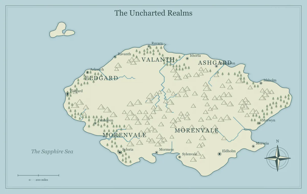
A fantasy map maker can produce a beautiful coastline while leaving the reader uncertain about which name belongs to which place. Typography solves that problem when lettering has a clear job. It identifies locations, establishes a hierarchy, and helps readers follow the setting. Decorative mood matters too, but a name that looks atmospheric and cannot be read has stopped doing its most useful work. Begin with what the reader needs to find, then choose lettering that supports that task.
This guide reviews a fictional map called the Bracken Sea. Its first draft has long kingdom names, several coastal towns, and a small island crowded with labels. The creator improves it through a series of deliberate passes rather than making every word larger. You can follow the same process with this fantasy map maker's label editor and supported text additions, then inspect the actual export at its final viewing size.
Decide what must be read first
Identify the audience's immediate task. A campaign player may need to find a starting town, a neighboring pass, and the port where the next adventure begins. A novel reader may need to understand three regions and the direction of a journey. Those tasks establish which names deserve the strongest presence. A map title can be prominent without competing with every place the reader is trying to locate.
For the Bracken Sea, the starting port and two major regions matter most. The creator puts them on a short priority list. Several incidental settlement names remain useful background, but they do not need the same size or weight. This choice makes the next typography decisions easier: each change should help a priority name stand out or keep supporting names readable without overwhelming the illustration.
The map planning checklist helps establish purpose before editing. Do not ask typography to rescue an unclear map brief. If you cannot decide which place matters most, adding ornate lettering to every name will create emphasis without creating direction.
Build a small hierarchy of names
Use a few distinct label roles rather than inventing a unique treatment for every location. A title, major region name, settlement name, and occasional supporting note are enough for many maps. Their differences can come from size, placement, or a consistent font choice. The reader should learn the pattern quickly: a large region name spans an area, while a smaller settlement name sits near a location marker.
Bracken's first draft makes every kingdom and town similarly prominent. The revised draft reserves larger lettering for the two principal regions and reduces incidental towns. The creator keeps town labels broadly consistent so a reader does not mistake one large town name for a new country. Exceptions can be useful, but they should have a reason connected to the map's purpose.
The label editor provides text size, ink color, and a small set of lettering choices. It does not provide an unrestricted typesetting system with every possible weight, tracking adjustment, curved path, or text effect. Work with the supported controls when they are sufficient. If a production design needs more advanced typography, export artwork and continue in an appropriate external application while preserving the generator's editable source.
Choose lettering for the reader's use
A serif can support an illustrated historical mood; a simpler sans serif can suit a clear reference map. These are design directions, not universal rules. Evaluate actual names in the selected style. Narrow letters, unusual shapes, and long strings behave differently from a short title. A lettering choice that works for Bracken may be awkward for a longer neighboring name.
Keep the number of lettering styles small. Using one family for most place names and a second treatment for a title can create a coherent page. Assigning every region a different family may suggest a useful cultural distinction, but it can also make the map seem like several unrelated documents. If cultural identity matters, use names and surrounding prose as well as typography so the distinction survives a font substitution or a monochrome copy.
Consider familiar letterforms when the audience needs to scan quickly. During a game, readers may be looking from a character sheet to the map while listening to a discussion. They need to distinguish names without stopping to interpret decorative characters. A readable map can still feel fantastical through its geography, symbols, palette, and naming system.
Shorten names before enlarging everything
A crowded map often has a naming problem as well as a placement problem. “The Sovereign Maritime Protectorate of Eastern Bracken” is difficult to fit beside a narrow coast. A public map might use Eastern Bracken while the full title belongs in a notebook or gazetteer. The shorter name retains identity without requiring a very small font or a long line that covers several unrelated locations.
Use short forms consistently. If the notebook records a place as the Kingdom of High Wold and the map shows High Wold, make that relationship clear. Do not casually shorten several similar names until they become indistinguishable. Westhaven, Westmere, and Westmark already share a beginning; abbreviating all three to West creates another problem.
The fantasy naming guide and fantasy name generator can help develop distinct names. Treat generated suggestions as starting points for your own setting. The typography pass is a good moment to notice repeated sounds, awkward lengths, or names that readers are likely to confuse during the actual project.
Place text where its relationship is clear
Keep settlement names close enough to their intended locations that the relationship is obvious. A label does not need to touch the symbol, but it should not be equally close to two settlements without another explanation. Move text away from dense terrain, river crossings, or another name where possible. Inspect both the new position and the place it originally identified.
This generator lets you drag generated labels, but that action moves the text rather than the underlying settlement marker or terrain artwork. Bracken's creator moves a port name slightly offshore to avoid mountain symbols. The port itself stays on the coast. Moving the name far across the sea would create a false association even if the lettering became easier to read.
Region names have a different relationship to geography. They can occupy an open area that represents a broad territory rather than sit beside a single marker. Yet the reader still needs to understand the intended area. If the map does not draw political polygons, do not rely on the exact span of a word to define a legal border. Explain territorial relationships in accompanying notes or a separately prepared boundary illustration.
Review crowded areas locally
Inspect one crowded area at a time. Identify the names that matter there, then remove or simplify information before moving text repeatedly. In Bracken's small island, three settlement names and a regional name compete for the same space. The creator hides one incidental label, moves another into a nearby open area, and shortens the region name. The island becomes clearer without increasing the map's overall complexity.
Check neighboring names after each meaningful change. Solving one overlap can create another on the other side of a bay. Zooming in helps edit, but zooming back out reveals the balance. A label that looks well placed at a large editing zoom may disappear at the final size or dominate the coastline when viewed in context.
Use the landmark and label editing guide for supported operations. Keep a saved edition before a substantial cleanup so you can compare the simplified result with the original. Undo is useful during a session, while a saved file preserves a deliberate checkpoint outside the current editing history.
Use ink color as a supporting distinction
Choose label colors that remain distinguishable from the actual background. A dark name over a dark forest can disappear even if the same color works on open parchment. The surrounding website's dark or light theme does not determine the palette inside the map. Review lettering against the selected map art style, including busy areas and decorative textures.
Do not communicate a crucial category through color alone. If blue names mean allied towns and green names mean rival towns, a reader may lose that distinction in a grayscale print or have difficulty perceiving the colors. A clear written key or distinct wording can carry the relationship separately. In many geographic maps, using broadly consistent label ink is simpler than giving every political affiliation a special color.
The monochrome map guide explains a useful proofing pass. A map that still makes sense when colors are reduced has a stronger information structure. That does not require abandoning color; it means ensuring that color supports information the reader can identify another way.
Test long and short names together
A typography sample should include the shortest important name and the longest. The short name reveals whether small labels remain readable. The long name reveals spacing, overlap, and the risk of ambiguity. If the chosen font makes the long name too wide, adjust the name, size, or placement deliberately rather than changing every label on the map.
Bracken's title is short, but the nearby Grey Lantern Peninsula stretches across several features. The creator uses Grey Lantern on the map and preserves the full geographic description in the location notes. Another short town name, Il, is easy to overlook and can be confused with ordinary marks. The creator renames it Ilmere because the town recurs in the story and deserves a clearer identity.
These changes are editorial decisions as much as graphic ones. Record important renamings in the worldbuilding notebook so chapters, campaign notes, and shared previews can be updated. A label can be visually improved while accidentally breaking consistency with the rest of the project.
Inspect the exported lettering
Download the format appropriate to the destination, then open the actual file. A PNG or JPG turns the displayed lettering into pixels, so final placement size determines how much detail the reader can distinguish. An SVG can retain text whose appearance depends on the destination's font handling. The file format does not remove the need for a typography review.
For a booklet, place the map at its intended physical dimensions and inspect an actual-size proof. For a digital reference, open it in the panel or screen arrangement readers will use. If a recipient must zoom constantly to find every important name, consider a simpler edition or a larger placement. Increasing export pixels alone does not make the same label occupy more physical space on the printed page.
Use the format comparison and print resolution guide to distinguish sharpness from physical legibility. A tiny label can be sharply rendered and still be too small to read comfortably. Typography and resolution solve related but different problems.
Provide words beyond the image
A map image cannot convey its full geography to every reader. If important information appears only in small names or colored territories, provide a place list or short textual description alongside it. Explain the main regions, useful connections, and the journey relevant to the surrounding content. The description can be concise when the map is decorative and more detailed when understanding it is necessary.
For Bracken, a companion paragraph identifies the starting port, the crossing to the island, and the northern region where the next scene takes place. Readers gain another route to the same story information. The paragraph also helps readers who can see the image but are viewing a small preview or listening to a discussion while consulting the map.
When preparing separate player and creator editions, review descriptions as well as labels. Hiding a secret island name in the picture does not help if its location is revealed in the accompanying text. The audience edition guide provides a practical review process for that distinction.
A final Bracken typography pass
The final Bracken review starts at ordinary viewing size. The creator finds the title, both major regions, the starting port, and the island crossing without zooming. Then the creator examines the crowded coast closely and checks that moved names still identify the correct markers. The important long name has been shortened consistently in the notebook. Incidental labels remain quieter than the main locations.
A second reader is asked to find three places using only the intended publication image. Their hesitation at one coastal label reveals an ambiguous association. The creator moves that text a little closer to its port and exports again. This review is more useful than asking whether the map looks beautiful, because it tests the job the lettering is meant to perform.
Save the approved editable edition and its image export together. Use the final review checklist before publication, and return to the fantasy map maker for the next focused change. Clear typography comes from a coherent hierarchy, sensible names, careful placement, and a proof at the reader's actual size.
Give the idea a world of its own.
Try the technique in the generator, then save an editable copy so you can return to your work.
Open the map maker ↗